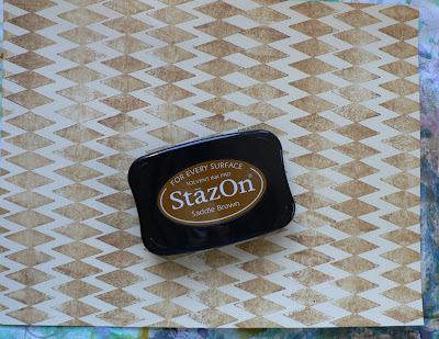
I need a "D" technique background for an upcoming swap and love the look of
Distressed Gesso, so thought I'd give it a go again. Before starting and to add a little "extra" to my background, started by stamping diamonds to the buff colored paper with brown
StazOn ink.
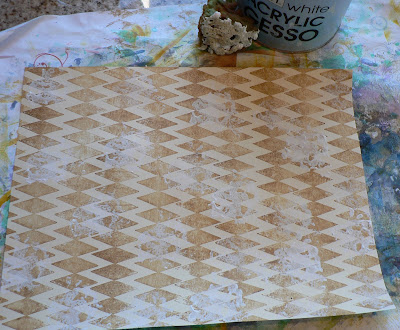
Used a sea sponge to add some
gesso to a few areas of the paper. Since I used a light application of
gesso, I
speeded up the drying with a heat tool really quickly.
Applied yellow Distress Ink with the Direct to Paper (
dtp) method.
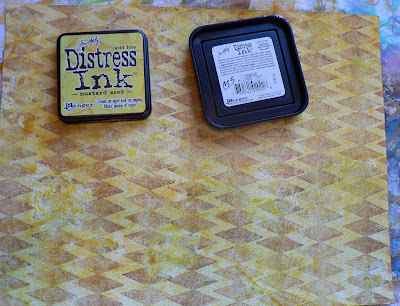
Added more
gesso with the sea sponge overlapping some areas and leaving others with no
gesso. Used heat tool to dry
gesso and colored with wild honey Distress Ink
dtp.
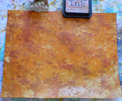
For the final layer, used watered down
gesso and covered large areas with the sea sponge. Dried the
gesso with the heat tool again.
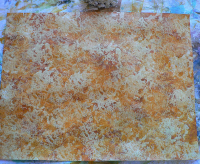
Colored with dried marmalade Distress Ink. I like how textured this looks.
There are many different ways to do this technique: how much
gesso you use, how you apply the
gesso, what colors ink you choose, etc.
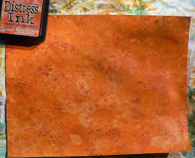
 Run an ink pad of a contrasting color of Distress ink over the raised areas.
 Run a dark color of Distress Ink on to a craft sheet. Swipe the inked textured grunge across the craft sheet picking up this ink to highlight the highest ares to add depth to the piece.
 Tim recommends inking the edges of the piece with Distress Ink and a blending tool. I've skipped this step, as I'm planning on cutting this up for another project.
 After doing all that, I realized I'd worked on the "back" of the grungepaper, so I did the same inking on the "front" side:


