I liked making the covers out of wallpaper samples. I have a few sheets that are kind of funky. I decided to play and see what I could come up with. I also had bought some badge holders that were vertical holders for badges, which means a horizontal orientation for a small booklet or holder. For the sheets of wallpaper seen below, I embossed with this folder and colored the raised areas with Brilliance ink and heat set.
 On the upper sheet in the above picture, I adhered it to thin cardboard and then ran through a second Cuttlebug embossing folder and colored the raised areas with the green Brilliance ink pad. I took some of the wallpaper scraps, ran them through the same embossing folder used the first time, colored with the brown Brilliance ink pad and then cut a decorative element with a Cuttlebug die.
 I like how the embossing and coloring really transformed these wallpaper samples. I used a black Sharpie to color the edges of the decorative elements. Front cover:
 I added sticker letters and an image to the inside front cover.
 Added an image and letter stickers on the inside back cover. (bad photo, stickers spell "explore").
 Back cover:
 For the second booklet, I choose some wallpaper samples that I didn't particularly like. I embossed the upper papers with the diamond folder and the lower papers with the floral folders. I decided I wanted the paper more blue than the original green color, so I was very liberal in applying blue Brilliance ink.
 I took the floral embossed paper, adhered it to a thin sheet of cardboard and embossed with the diamond folder and colored with the platinum Brilliance ink.
 I had some scraps of wallpaper left over from yesterday's project. cut it out with a Cuttlebug die and ran a platinum Brilliance ink pad over the surface to add to the outside covers.
 I added a rub on and some stickers letters on the front cover.
 I added an art quote on vellum to the inside front cover. This softened the geometric pattern.
 And added another quote on vellum to the back inside cover.
 Back cover:
 I like the covers so much more than how the original sheet of wallpaper looked.


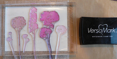 I taped down a torn strip of masking tape and sponged on a blend of three shades of green dye inks with a jumbo dauber. Remember to rub on the dye ink firmly to expose the resist images. Rub the ink from the edge of the masking tape toward the right edge of the card.


