Monday, April 27, 2009

Another Pencil Box

Adrienne's birthday is coming up. I decided to decorate another pencil box, but with brighter colors for her. Here's how it turned out:

First, I painted the inside with turquoise Lumiere paint and let it dry.
Covered the outside of the box (but not the bottom) with DAP sealant using a wad of cheese cloth to create texture. When I took a class by Michael deMeng, he said to use acrylic or latex base, not silicone as silicone doesn't take paint. He also said the paint will show up better on white and not the clear sealant. I tried to put on a thin coating of sealant, so it would dry faster. I also used a heat tool to help speed the drying. Using a heat tool, can add some interesting additional texture: bubbles! Since my sealant was thin, the bubbles are very tiny and blend in well with the rest of the texture.
Once the sealant was dry, I made a mixture of yellow acrylic paints on the outside of the box.
Then created a wash with a mixture of d. purple, p. green & p. blue, brushed this over the box, then removed lots of the color with baby wipes for this lovely mottled look.
Once that was dry, brushed on a layer of gold Lumiere paint mixed with acrylic glazing liquid. Then waited for this layer to dry.
Stamped dragonflies onto the outer surfaces with brown StaZon ink.
Colored the dragonflies, by dabbing my fingers in the different colors and smearing over the stamped images. Make sure to let the paint dry between colors, unless you want the colors to muddy.
Used the p. green and p. blue paints to color the background of the box. The box is now blue & green with golden undertones.
To add a little fun, I wrinkled up some iridescent wrapping paper, ran it through the xyron adhesive and punched out small dragonflies.
I attached these to the top and sides of the box. I like how they change in the light. They might appear as barely seen to bright & shiny. In the picture below, notice how you can barely see the punched out dragonflies on the top of the box, where the ones on the front seem to shine.
For the inside of the box, stamped dragonflies with brown StaZon ink onto both the iridescent gift wrap and on to gold tissue paper.
These were cut out and adhered to the inside top of the box. I also added an "art" quote, along with the admonition "so play".
Hope Adrienne will enjoy this box and find it useful to store art supplies or whatever she likes.

Saturday, April 25, 2009

Book Study - Distress with chalk ink and masking tape

We're doing a Book Study as a group on NGS, using Nancy Curry's book "Texture Effects for Rubber Stamping". This week we are looking at her projects "Botanica Palette" & " Tuscan Column". She uses chalk inks and masking tape to create a distress background. Nancy used a palette stamp as a surface to work on and soften the chalk inks. Her palette stamp and a fabulous border. I didn't have a palette stamp, but did have a "Mirror" or "Reverse" stamp. This is just plain rubber mounted onto a wood block. I'm sure you could find other surfaces to work with as well.
First I stamped a green chalk ink directly onto the rubber. Leaving room for more colors.

Next, rubbed a strip of masking tape into the brown chalk ink, then pressed that onto the rubber, adding more ink to the masking tape as needed. The use of the masking tape keeps your ink pads from being contaminated with other inks. Also gives a great texture.
Then used a different piece of masking tape with yellow chalk ink to add more color, making sure to leave some "white" space on the rubber.
Then stamped this assortment of inks onto matte paper (do not use on glossy or coated papers, the chalk inks will smear and may not dry). I cut the matte paper slightly larger than my stamp to create an easy white border. Heat set the ink.
Stamped an image an a saying with brown StazOn ink. And used this ink to color the edges of the matte paper.
You can see the colors and the distress look better, when I take this piece over to some natural light.
I ran some yellow textured card stock through a numbers Cuttlebug embossing folder and lightly inked it with the same brown chalk ink used earlier.
Attached the stamped piece to the embossed layer with black brads, and layered it all onto a dark brown card.
I did the next card using the same method with 3 different blue chalk inks. Inked the darkest blue directly on the plain stamp, then added the other two shades of blue with a piece of masking tape.
I then stamped this assortment of inks onto a piece of white matte paper, and then heat set.
I covered the card stock with a texture stamp using purple chalk ink. Stamped a quote and an image with black Versafine ink.
I was looking for some floral embellishments, and went to this fabulous collection of goodies I received from Kathi DiCarlo in a Fabulous Floral swap. She sent me two ATCs, made this fun floral box and FILLED it with a wonderful assortment of floral embellishments for me to use!!!
I used 3 of the flowers in the bottom left corner, colored a silver metal flower bead with copper alcohol ink and glued it to the image, and glued a copper metal butterfly to the upper right corner. This was adhered to a dark purple card.

Wednesday, April 15, 2009

CB Folder Holder for Maggi

Maggi is the "It Girl" on Art-Venturers for May. I wanted to make her a Cuttlebug embossing folder holder, as she likes her Cuttlebug as much as I like mine. I found that the A2 embossing folders will fit into 4" x 6" photo page holders. You can place two embossing folders in each page holder, but it makes the book difficult to close. The folders in the picture will NOT go to Maggi, she'll need to fill the book with her own embossing folders LOL. I used the Zutter Bind-it-All to bind the photo page holders to my covers.For her "It girl" theme, Maggi choose "something related to a piece of literature/movie/song". I love the musical "Les Miz" with it's story of grace, redemption and love. I played through the sound track a couple of times while creating this piece.
For the outside covers, I wanted to experiment with canvas paper and some embossing folders. I cut the canvas paper and 1" larger than the cardboard to be used for the covers. I made a wash of blue and purple acrylic paints on the canvas paper. Then sprayed a wash of water and Perfect Pearls over the surface (doesn't show up in the photos).
I adhered a thin sheet of cardboard (the size of the cover) to the back of the canvas sheet before running it through the Cuttlebug. Because the canvas paper is almost twice as long as the CB embossing folder, I ran each sheet through the Cuttlebug twice, embossing half the paper at a time. Colored the raised areas with brown StazOn ink.
I then ran the sheets through the Cuttlebug again, this time using the musical score embossing folder. I dipped my finger into the sparkle Lumiere paint and ran it over the raised areas, getting the paint down into lower areas.
Colored the raised areas with Distress ink. Light lavender on one sheet.
Blue distress ink on the other sheet.

I decided these background pages needed a little "something". I stamped a flourish with gold Encore ink over the surface. It doesn't show up in the photo. But the gold is seen as the cover is moved in the light.
For the inside covers, I used some paper that had been in the bottom of my spray box, cut them down to size and stamped the same flourish with gold Encore ink over the surface.
To finish the front cover, I adhered some crochet lace. Stamped a quote by Victor Hugo and sung in "Les Miz" onto some "Mica & Alcohol Ink" background paper I'd made earlier. I cut out a vintage image that went well with the quote, and added a heart charm with another image in its center.
Inside front cover, added paper printed with a musical score, rubbed gold Encore ink over the surface, stamped on the same flourish, added a vintage image and added some more flourishes with the gold Encore ink. Stamped another Victor Hugo quote with black Versafine ink and added a metal charm.
Back inside cover done the same way, used a different quote, image and charm.
Back outside cover, adhered another piece of crochet lace and a cut out vintage image.
This booklet is not a "Les Miz" booklet, but inspired by the music & lyrics. Hope Maggi puts it to good use.

Saturday, April 11, 2009

ATC Holder for Fiona

Fiona's birthday is this month and I want to send her a present when I mail off the ATCs for the ATC swaps she hosts on ccswaps. I had an idea to use some of the shaving cream backgrounds I made earlier today for the inside covers of an ATC holder. For the outside covers, I cut out two pieces of Double Saran Watercolor Spray background I made last fall (it's the first one shown on this post).

I wanted a bit of orange on the covers, but this was more intense than I wanted. After running them through a Cuttlebug embossing folder, I made a wash of translucent acrylic paint to brush over the surface and then wiped off with a tissue.


To highlight the texture, I colored the raised areas with a dark green Brilliance ink pad. Now these covers have just a hint of orange.

I cut the shaving cream backgrounds down to size and stamped on sayings with black Versafine ink. The dragonflies on the left page, were stamped in orange Distress ink, then over stamped in grey dye ink. The butterflies on the right page where stamped with black Versafine ink, and then the solid part with the orange Distress ink.

After adhering the front and back covers together, I colored the edges with a Copper leafing pen. Then I bound the covers and hard plastic name tag holders with a Zutter Bind-it-All.
For the front, I added an image of a girl over copper skeleton leaves, stamped some words to the bottom of her skirt with black Archival ink. Letter beads were sewn on with copper fibers.

Inside front:
It's difficult to see in these photos, but the marbling of the shaving cream background makes me think of flight. Inside back:

Outside back:

Book Study: Shaving Cream Part 2

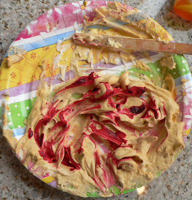
I couldn't throw the messy shaving cream out from my play earlier today. I like to start with colors that blend well together, so after they get all mixed up, I can add additional color to get even more backgrounds. I choose an intense red.

Swirled it in:
And made a couple of sheets of background paper.

Decided to make one more addition to the shaving cream, by adding two colors of purple.
Here's how it turned out.
Not sure what I'll do with them, but I love having lots of backgrounds on hand to choose from.