Friday, July 23, 2010

Book Study - Water Webbing

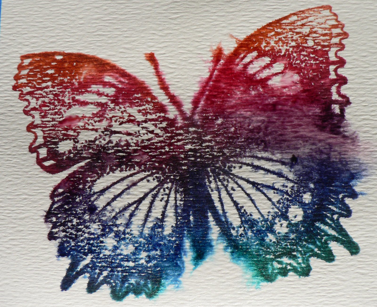
In our ongoing book study project on NGS group, we are looking at the section on Water Webbing in Julia Andrus' book "Paper Transformed". Julia recommends using a soft- cold-pressed watercolor paper that is 120 lb or heavier for this technique. (I used scraps from my stash, not sure what kind of watercolor paper it is). Make sure you check out Julia's book to see how this technique is supposed to look.
Tape the paper to keep it from curling, then spray with water and wipe off the excess water.
Firmly press a bold image stamp into dye based ink to get it well inked, then stamp onto the watercolor paper.
Lift off the stamp and immediately spray with water. Julia says to spray just once and the pressure from applying the water will move the paint into the webbing patterns.
I'm not sure if I've used the wrong type of watercolor paper, or the hot sun is drying my paper too fast or my spray bottle is too fine of a mist. I sprayed a couple of times:
Here's another one done with a rainbow pad and a large butterfly stamp:
Done again with the same inked stamp, with a lighter amount of ink on the stamp:
This is what happened when I forgot to wipe off the excess water after spraying the watercolor paper and stamping the inked image:

Thursday, July 22, 2010

Ceramic Tile Necklace

Autumn sent me these tiles awhile ago and I wasn't sure what to make with them. They are very light weight, so I decided to make a necklace out of one of them. I love the coloration on this tile. Before soldering the tile, I stamped a grungy butterfly image on the tile with Black StazOn ink and heat set.
Also before soldering, I cut out a piece of a Worksheet Wonder (like in the previous post) and adhered to the back of the tile and coated it with Liquid Glass.
To add some dimension to the piece, stamped on parts of words with Azure blue StazOn ink to one half of the tile and heat set.
[7/22/10 Last night's photos were so poor, I retook these two last photos this morning.] Added 2 dark pewter beads to each of the jump rings attached to the tile, and added blue fibers and a large silver bead to the bottom of the piece.
Reverse side of the necklace. I think this looks well worn with either side showing.

Sea Glass Necklace

I found this piece of Sea Glass on the beach when I was at Klaloch earlier this month. I love it's shape and decided to use it in a necklace for a solder swap on Art-Venturers. Because it is cloudy, I decided to use a bold contrast paper under the glass. The paper is from a Worksheet Wonder I made similar to this post. I used Liquid Glass to attach the paper to the sea glass.
Has an ethereal appearance.
Stamped an image on top of the sea glass with Azure blue StazOn ink and heat set.
On the back, glued on another piece of the same Worksheet Wonder to the back of the sea glass and covered it with Liquid Glass.
Soldered around the uneven edges (so much fun) and added jump rings. Added large silver bead on the top with the cording. Added small blue beads and a silver key charm to the bottom jump ring. The photo doesn't show off the dimensional aspect of the images and the glass very well. The appearance changes as it moves in the light.
Reverse side. I think this necklace looks great on both sides.

Sunday, July 18, 2010

Fun/Joy page for Vision Book

I signed up for a Vision Board Fat Book swap on the DCI group. "A vision board is typically a board on which you paste or collage images, words. It's simple. The idea behind this is that when you surround yourself with images of who you want to become, what you want to have, where you want to live, or where you want to vacation, your life changes to match those images and those desires." We were each given a theme and instructed to create our own take on these themes.
I was given the theme of Fun/Joy. We were instructed to have lots of fat embellishments (but not on the left side where the binding will take place). I had a picture of my granddaughter swinging with a very joyful face, I altered it in Photo Shop with the brush stroke option. The background is in grey scale, except for the Shakespeare quote on the bottom. The main image was printed in color and layered on several sheets of card stock and cut out to make a raised image. Large wings were Azure blue Stazon ink stamped on Fantasy Film, ironed to heat set and cut out. Paper butterflies were punched out of music sheets painted with a wash of blue paint and Perfect Pearls. Used a blue gel pen to write Play! on the image. Colored fibers were tied to the side of the page and I added silver colored charms with the words "laugh", "be yourself" and joy and a dragonfly. A large silver colored filigree Butterfly was added to the top right corner.
The back page reflects the underlying foundation of my joy: unconditional love. I printed the words of the Michael W Smith song "Never Been Unloved" over another photo and added a silver colored heart charm with the word "Love".
These pages are packed up to be sent off. I'm looking forward to getting back the book and seeing all the other pages next month.

Friday, July 16, 2010

Ostrich Leather Paper

This technique is also from Julia Andrus' book "Paper Transformed" and is a variation of the Leather Paper shown below. Spray card stock (I used a piece of manila folder) on both sides with Perfect Ink Refresher and gently rub onto the paper. Repeatedly crumple the paper to achieve the texture you desire. Iron the paper flat.
Lightly spray the paper with water and wipe off with a paper towel. This slight added moisture prevents ripping during the next step.
Place paper on a piece of foam (or a computer mouse pad) and repeatedly lightly press the round end of a paint brush into the paper.
Iron this same side of the paper flat.
Turn the paper over and lightly rub a dye ink over the surface:
Here's my finished piece:

Embossed Leather Paper

This is a variation of the technique done below. Spray a "leather like" colored piece of card stock with Perfect Ink Refresher on both sides, gently rub it in and repeatedly crumple the paper to achieve the texture you desire. To make an embossed image or to cover a 3 dimensional object, do not iron.
While the paper is still damp from the Perfect Ink Refresher, placed in an embossing folder and run through the Cuttlebug.
I rubbed dye ink over the raised areas to highlight the embossing.
Finished piece:

Leather Paper

This week in the ongoing study of Julia Andrus' book "Paper Transformed" in the NGS group, we're studying the section "Leather Paper". Spray a "leather like colored" piece of card stock with Perfect Ink Refresher and gently rub onto the paper.
Repeatedly crumple the paper to create the desired texture. The use of Perfect Ink Refresher gives the paper a leather like feel.
If you'll be using the paper as a flat piece, iron it flat to dry.
If desired, accent the piece by gently rubbing a dye based ink over the surface.
You can achieve different looks, by what color paper you use and the amount of crumpling you do and whether and what ink you use.