
Sorry, I didn't realize that part of this picture was blurry before giving away this quilt.

 Tore up different yellow green and green yellow background papers and stamped with different shades of green.

 First: punching out scraps. I like the different black & cream papers punched out in hearts. With I love you stamped in the middle.
 Then punching out butterfly shapes and placing them on paper embossed with different embossing folders:

 Then using paper strips. First, cutting our decorative edges out of the top paper and adhering over strips of background paper.
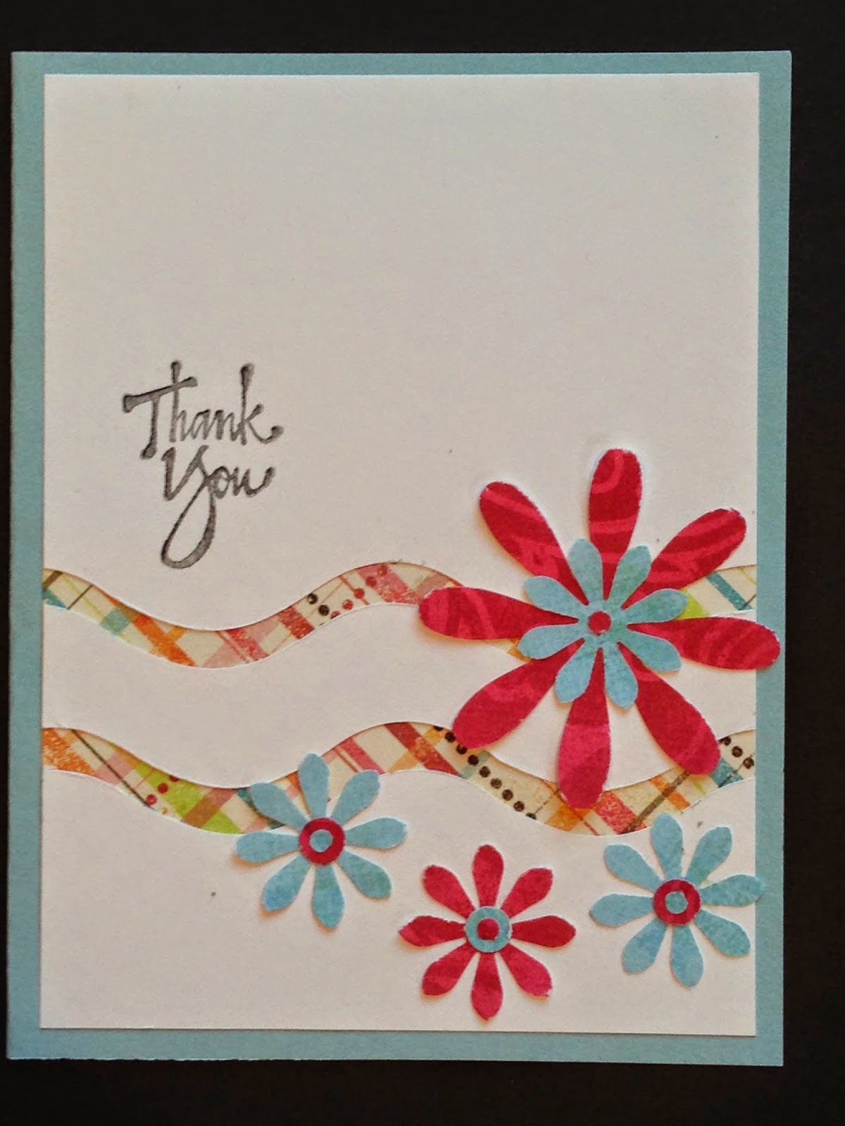 On this one I also added flowers punched out of scrap paper and dots from a paper hole punch.
 Used coordinating paper scraps in vertical strips to make a background and added two other papers underneath and layered all on a blue paper. To blend these different papers together, I stamped over them with a large confetti stamp. Also stamped and cut out a cupcake and added a punched out candle.
 This is the same layout with different papers and added punched out flower.
 Same card with different papers.


 Placing inches in a grid pattern and added a punched dragonfly, a small rhinestone and color the center piece with glitter pens.
 Then I found a pattern using 3/4" squares (assorted scraps) over two different pattern papers. Also added a decorative butterfly, "pearl" and tied on some fiber.


 The color is Bronze in August for the Color Perceptions ATC Swap on the ArtVentures Group. The ATC is to be predominately bronze and be how the color bronze makes us feel. Bronze is my favorite metallic color, it makes a great accent with any color and I find bronze to be "harmonious".
 The theme for ATCs on ArtVentures group is "Adventure".


 Next, sponged on honey dye ink over a stencil, then stamped a sun image in orange Distress Ink, then heat set.


