We're doing a study of Tim Holtz's book "A Compendium of Curiosities" on NGS group This week we're looking at the section "Double Distress". First emboss a texture design onto grunge paper or board. Ink over the entire surface with Distress Ink using a blending tool. Work the ink into the recessed areas as well as the raised areas.
Run an ink pad of a contrasting color of Distress ink over the raised areas.
Run a dark color of Distress Ink on to a craft sheet. Swipe the inked textured grunge across the craft sheet picking up this ink to highlight the highest ares to add depth to the piece.
Tim recommends inking the edges of the piece with Distress Ink and a blending tool. I've skipped this step, as I'm planning on cutting this up for another project.
After doing all that, I realized I'd worked on the "back" of the grungepaper, so I did the same inking on the "front" side:
Thursday, July 28, 2011
Wednesday, July 27, 2011
Dreams are Necessary to Life ATC
While going through my supplies today, I found a broken bird cage made with the Rusted Grunge technique, and decided it was time to play with it.
Took a piece of Glue Resist background and stamped on reverse numbers with black StazOn ink. Colored the edges and some of the surface with dark brown StazOn ink.
Added the rusted grunge bird cage, a fairy image, the words and a dragonfly brad with some small blue rhinestones.
Took a piece of Glue Resist background and stamped on reverse numbers with black StazOn ink. Colored the edges and some of the surface with dark brown StazOn ink.
Added the rusted grunge bird cage, a fairy image, the words and a dragonfly brad with some small blue rhinestones.
Embedded Embossing
I was looking for some new to me "E" techniques this morning., and I came across this technique: Embedded Embossing on a Youtube tutorial. This technique takes different elements and unify them together by embossing them after they've been adhered together.
For the first one I took a Glue & Mica Powders background, a little beauty I received in a swap, part of a music sheet, a butterfly image and some small butterfly stickers. Glued these together and used the embossing folder recommended in the YouTube video mentioned above.
Here's how it turned out:
This piece can know be layered onto a card without adding a lot thickness.
I wanted to try this technique with other embossing folders. I choose a Gesso Off Background, some Asian newsprint and a dimensional "little beauty" I received in a swap, along with a floral embossing folder.
Here's how it turned out:
For the last one, I choose a Glued Chalk/Pastels background ( I colored the edges with dark brown StazOn ink), a piece of map colored with light brown StazOn ink, some map stickers, and a clown image. These were adhered and run through brick embossing folder.Colored the raised embossed areas with tea dye Distress ink, and added a slightly smaller version of the same clown image over the top.
Lots of variations and possibilities with this technique.
Thursday, July 21, 2011
Book Study - Alcohol Ink Splatter
We are doing a book study of Tim Holtz's "A Compendium of Curiosities" on NGS group. This week we are looking at the section Alcohol Ink Splatter. You can see Tim doing a video of this technique. Place a drop of alcohol ink onto glossy card stock.
Use canned air to move the ink around while it is still wet.
Repeat the above steps with as desired with other colors. Apply 3-4 drips of Blending Solution.
Tim said to add one drop of Metallic Mixative (you can see that I did 3 large drops instead) into the Blending Solution puddle.
Blast with canned air. I think my use of extra gold Metallic Mixture overpowered the alcohol splatter. Doesn't look anything like the Alcohol Ink Splatter technique, but I'm sure I'll find a use for this background ; ) Experimenting is fun!
Decided to add more Blending Solution and blast it with more canned air.
Saturday, July 16, 2011
Book Study - Alcohol Ink Monoprint
On NGS group, we are studying Tim Holtz's book "A Compendium of Curiosities". This week is the section "Alcohol Ink Monoprint". Squirt, dribble, or scribble an assortment of alcohol inks onto a craft sheet.
Apply a drop of metallic ink in the center.
Sprinkle on a small amount of Blending Solution.
Place glossy card stock, glossy side down in the ink, swipe through the ink. Working quickly, re-swipe the paper through the inks again, changing directions. As the alcohol inks dry quickly, the ink should create layers of colors, not muddying of the colors.
Here's my sample. Fun!There was still some ink on my craft sheet, generously added more Blending Solution and used a new piece of glossy card stock to pick up these colors.
Friday, July 15, 2011
Bling ATC
For this month's ATC, we were asked to use some bling, any where we wanted. I started by making wings with Fantasy Film. Used a piece of Mother of Pearl Fantasy Film twice the size of my wing stamp, folded in half and re opened. Cut up scraps of other colors of Fantasy Film and layered on top of the larger piece.
Re folded the larger piece of Fantasy Film with the little bits inside. Stamped a wing stamp with black StazOn ink, placed the Fantasy Film on the inked stamp, then a piece of parchment paper, heated with a hot dry iron to melt the Fantasy Film together.
Here's how it looks in the window, before cutting out the wing.
Adhered decorative paper over an ATC back, added a vintage image with the Fantasy Film wing and a paper crown, flower shapes and lots of colored rhinestones and decorative beads. There is a small amount of Rock Candy Stickles on the dress, but it doesn't show up this picture. I love how the light plays of the colors in the Fantasy Film wing!"How Does Your Garden Grow?"
Sunday, July 3, 2011
Book Study - Alcohol Ink Agate On Grunge
On NGS group, we're doing a study of Tim Holtz's book "A Compendium of Curiosities", this week's section is Alcohol Ink Agate On Grunge. Start with painting the surface of grunge with acrylic paint and let it dry. (Tim said to use Pearl, but I didn't have that color, so I used Snow Cap White). The purpose of the paint, is so the alcohol ink doesn't absorb into the grunge, but will "float" on the surface.
Apply several colors of Alcohol Ink onto felt along with a drop of Mixative (I choose gold) and stamp the ink over the painted grunge.
Apply some Blending Solution onto the felt and stamp over the background to blend and move the colors. Let dry.
Stamp on image with Archival Ink and heat to dry with a heat tool.
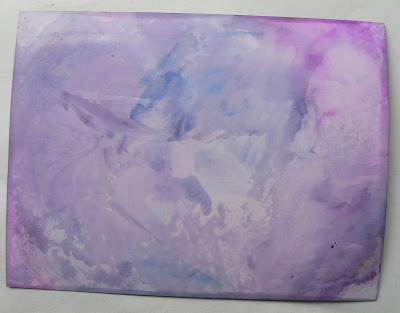
The colors I got, didn't seem as intense as in Tim's book. I wasn't sure if it was more fair photography skills, or if it was the choice of paint in the first step. I repeated the process starting with painting the grunge with Silver acrylic paint (I still don't have Pearl acrylic paint). In the photo below, the one with the white paint is on the left and the one on the right was done with silver paint. There is a difference, choose what look you prefer.Tim says this technique can be done on any surface from fabric to wood.
For Fun
Made a divider for my ABCs of Technique ATC swaps folder, the background is the Double Saran & Watercolor Sprays Technique:
Saturday, July 2, 2011
"D" technique ATC
This month at Art-Ventures we are up to the letter "D" in our ABC's of techniques ATC swaps. I started with the Distressed Gesso paper I made earlier. Cut it into ATC sized pieces, ran it through a Cuttlebug Diamond Embossing Folder and colored the raised areas with gold Encore! ink.
Used black StazOn ink to stamp on a background image, color the edges of the ATC and to darken the raised diamonds.
Stamped a dragonfly image with black StazOn ink on to yellow gold metallic paper. Used Dyna label maker to spell out "D R E A M".
Used black StazOn ink to stamp on a background image, color the edges of the ATC and to darken the raised diamonds.
Stamped a dragonfly image with black StazOn ink on to yellow gold metallic paper. Used Dyna label maker to spell out "D R E A M".
Distressed Gesso again
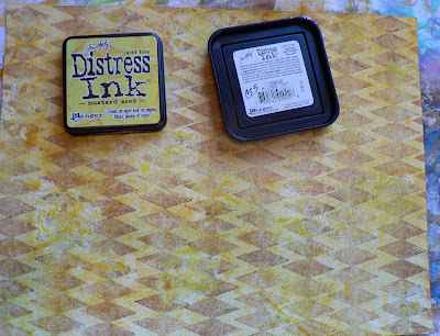
I need a "D" technique background for an upcoming swap and love the look of Distressed Gesso, so thought I'd give it a go again. Before starting and to add a little "extra" to my background, started by stamping diamonds to the buff colored paper with brown StazOn ink.
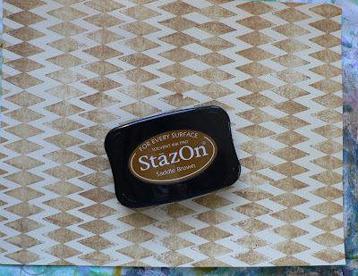
Used a sea sponge to add some gesso to a few areas of the paper. Since I used a light application of gesso, I speeded up the drying with a heat tool really quickly.
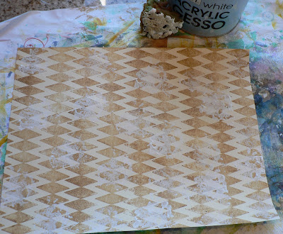
Applied yellow Distress Ink with the Direct to Paper (dtp) method.
Added more gesso with the sea sponge overlapping some areas and leaving others with no gesso. Used heat tool to dry gesso and colored with wild honey Distress Ink dtp.
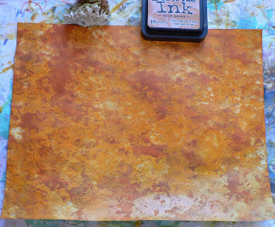
For the final layer, used watered down gesso and covered large areas with the sea sponge. Dried the gesso with the heat tool again.
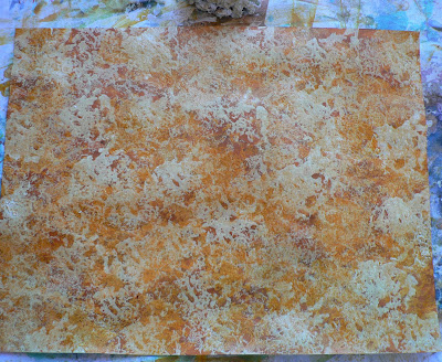
Colored with dried marmalade Distress Ink. I like how textured this looks.
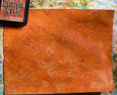
There are many different ways to do this technique: how much gesso you use, how you apply the gesso, what colors ink you choose, etc.
Subscribe to:
Posts (Atom)