Tuesday, January 31, 2012

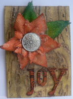
ATC Inspired by Tim's 2010 Day 7 Tag

This ATC uses several of the techniques Tim Holtz demonstrates in his 2010 Day 7 tag (12 Tags of Christmas).
Color one side wood embossing folder, run through machine with Manila card inside. I love how the ink is pressed into the debased areas.
 Colored raised areas with darker brown and forest moss Distress inks. Heat set or let dry thoroughly.
 Color canvas sheets. For the flower I used red & yellow color wash spray and a home made yellow spray and gold perfect pearls. Let dry.
 For the leaves, colored canvas sheet with green color washes, a home made green spray and green perfect pearls. Let dry.
 Adhered canvas to grunge paper and cut out flower shapes and leaves with die cut machine. Colored edges with darker shades of Distress Inks.
 Coat wood grain ATC surface with rock candy Distress Stickles. Shape petals and leave, then used rock candy Distress Stickles on one edge of flower petals and both edges of the leaves. Let dry.
 Used glue gun to glue broad side of petals down and the leaves. Used large decorative brad as flower center.
 Colored grunge board letters with Spiced Marmalade Distress Ink. Stamped music sheet with black Archival Ink over the letters.
 Adhered letters to the ATC. Love all the fabulous textures on this ATC!

Monday, January 30, 2012

K is for Kissed Impressions Stamp Technique

I found this technique on Too Cool Stamping, she has a post here and here on this technique. Angie describes this technique as a combination of Tim Holtz's stamping on texture fades as seen in this video, and the kissing technique.
Choose an embossing folder that has a large blank area in the part that will be de-bossed. On the side of the folder that has the blank area raised, color with a dye ink by rubbing or pressing the pad over the surface. Do not push ink into the other areas.
Next, choose an image or background stamp, ink it in a darker ink color and "kiss" or stamp this stamp into the inked blank area of the embossing folder. You may need to "huff" or breath over the inks to moisten them before the next step.
You can place your paper to fill the embossing folder or choose a portion of the folder as I have with this ATC back. Run through your embossing machine.
With this technique you have a "kissed" image on the de-bossed area of your paper. I realize this image is hard to see as I used a fine image background in an ink color not much darker than the inked folder.
I repeated the steps above with an image that is a bit bolder and a darker brown ink.
Here is the result. I think you'll have lots of fun with this technique!
Make sure you check out the fabulous creations on Too Cool Stamping.

ATC Inspired by Tim's 2010 Day 6 Tag

This ATC uses one of the technique's Tim Holtz demonstrates in his 2010 Day 6 tag (12 Tags of Christmas).
On the side of the embossing folder with the image depressed, stamp on flourishes with Distress ink, then place paper in embossing folder and emboss as usual.
 The stamped images remain in the background area, non on the raised areas.
 Used blending tool color raised areas with Distress Inks.
 Colored edges with vintage photo Distress Ink. Then used distress tool to roughen up edges, then colored with gathered twigs Distress Ink.
 Stamp on speckled image with gold acrylic paint around edges, let dry (wash acrylic paint off rubber stamp before it dries).
 Stamped saying with seed preserves Distress ink. Added dictionary page words over same in saying. Added fairy image and metal heart charm.

Sunday, January 29, 2012

K is for Kissing with Depth Stamping Technique

This is another variation of the Kissing technique.  I found this method of stamping described on about.com here, but renamed it from two toned kissing to kissing with depth (I can't help it, it will soon be Valentine's Day).

Choose a bold image stamp, like this large flourish. Choose an image, ink with one ink color (I used tulip) and stamp it on to the bold stamp.
 Choose a different image (here a background music score), ink it with a different color ink (I used Indian Corn Blue) and also stamp it on to the same bold image stamp (which is now on top of the red floral image).
 Huff on the bold image stamp and stamp it on to paper. The different colors add depth to the bold image stamp. I love the shabby chic look this has.
 I also found another dimension (or maybe I should say another look) to this technique by first inking the bold image stamp with a light ink color (I used bamboo) before stamping the other two inked stamps on top (same stamps & colors as above).
 I used the same three colors of ink and the same floral image and music score as above on a large medallion stamp.
 Inked medallion stamp in light pink ink, stamped on a light floral image in green ink then stamped the bolder floral image in tulip, gives a very different look with alternate color choices.

K is for Kissing with a Twist

This technique is a variation of the Kissing Technique. And the instructions are basically the same with a slight "twist".
Here you see the basic kissing technique. The bold leaf stamp was inked with yellow dye ink. A floral image was inked with red dye ink and "kissed" or stamped on to the bold leaf stamp. After giving a good breath over the stamp to moisten the ink (huffing), the stamp was stamped on to paper for this result:


For the "Kissing with a Twist". Stamp the bold stamp with a light color dye ink, stamp the other (here floral image) stamp with a dark ink and "kiss to the bold stamp. While hold the top stamp, twist it 1/4 turn before lifting off.

  The twisting changes the image of the stamp that was twisted and removes some of the ink from the bold image stamp. 


Then huff on the stamp and stamp it on to paper. Compare the image below with the basic kissing technique shown in the first photo of this post. Same stamps, same inks, very different look. I love how this turned out.
Instead of "twisting" one large stamp on to the bold stamp, you could repeatedly stamp a smaller image.

K is for Kissing

This is a fun technique that has been around for a long time. Lots of different looks depending on which stamps and colors you choose to use. I've seen it done two ways.
One method is to choose a solid/bold image stamp and a background stamp. Ink the background stamp and "kiss" it to the solid/bold image stamp. In other words, stamp the inked background stamp on to the solid/bold image stamp.
 Then stamps the solid/bold stamp on to paper. You'll have the shape of the solid/bold image stamp with the detail of your background.
 The other method I've seen is to ink the solid/bold image stamp with a light color ink, then ink the background stamp in a darker ink and "kiss" the solid stamp. If needed "huff" or breath on to the stamp to keep the ink moist and stamp on to paper.
 With this method the bold image is prominent with the detail added. Both are cool.
 Depending on how you want your image to look, use a much darker ink for the background image as seen on the right below.
 If you choose a less detailed background stamp, the basic bold image will not be as clear if you only ink the background stamp (as on the left) and not both stamps (as on the right). Both are OK, it depends on what effect you are going for.
 You don't have to use background stamps. You can stamp other images on to you bold stamp. Here is a butterfly on the left and a fairy on the right. Here it is needed to stamp the bold stamp, or you won't see the outline at all (when using images smaller than the overall size of the bold stamp).
 Here's another sample. Remember that the image you stamp on to the bold stamp will be a "mirror" image of your original stamp. This means words and numbers will be backwards, unless you have those reverse image stamps Tim Holtz makes (and maybe others are out there also).

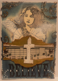
ATC Inspired by Tim's 2010 Day 5 Tag

This ATC uses some of the techniques Tim Holtz demonstrates on his 2010 Day 5 tag (12 Tags of Christmas).
Used black Archival Ink to color only angel part of this collage stamp, and stamped it on to Manila card.
 Used white acrylic paint around edges of card, let dry.
 Inked card background with blue Distress Inks. Used damp paper towel to remove ink from white paint.
 Stamped flourishes with black Archival Ink.
 Used frayed burlap distress Stickles over stamped flourishes. Used finger to add white acrylic paint to angel's dress and wings. Let dry.
 Cut out label shape from grunge paper. Coated with thick layer of burnished brass Distress crackle paint, let dry.
 Sanded edges. Colored edges and surface with vintage photo Distress Ink.
 Stamped word "BELIEVE" with black Archival Ink, added white embellishments with enamel accents. Added torn music tissue tape, and a cemetery cross (part of picket fence used in the 2010 Day 1 ATC).