Friday, May 28, 2010

Chris' Mini Memory

June is Chris' month for mini memories on DCI group. She choose Wings as a theme and the colors purple with gold/ silver. Painted a canvas with q. nickel azo gold acrylic paint. Then covered the canvas with a mixture of light molding paste and d. purple acrylic paint. Used a flourish stamp to remove some of the molding paste and create texture, let dry.
Decided the background color looked more coppery than gold. Made a wash of purple Color Wash, acrylic glazing liquid and purple Perfect Pearls and covered the canvas, let it dry.
Rubbed gold metallic Rub-ons over the canvas.
Added silver metallic acrylic paint to the edges of the gold Polished Metal wings I did earlier to give them a distressed look. Added the wings to the canvas along with a vintage image colored with purple metallic Rub-ons, a heart lock charm, a key with dictionary banner and a music scale ribbon. Inside of the lock and the key were colored with purple alcohol ink.

Book Study - Polished Metal

On NGS group, we're doing a study of Julia Andrus' book "Paper Transformed". This week we're looking at the section "Polished Metal". Start with die cuts, you can use purchased ones, as I did, or make your own. If your pieces are thin, adhere 4 to 6 matching pieces together.
Cover the top of the piece with clear embossing ink and Ultra Thick Embossing Enamel UTEE) and heat set.
As the UTEE melts, continue to heat and add more UTEE. Do this a couple of times to add thickness to the piece.
Allow the piece to cool enough to rub Perfect Pearls on the slightly warm surface.
The powder bonds with the UTEE to create a lasting finish. You can create different finishes depending on the mica powders you use.

Vickie's Mini Memory

May is Vickie's month for mini memories on DCI group. She choose a theme of Wings and colors purple and lime green. I started by painting the canvas with d. purple acrylic paint. Then mixed the purple acrylic paint with light molding paste. Covered the canvas with this mixture and used a texture tool to create a design and let it dry. Stamped a large butterfly image on Sheer Heaven paper and embossed with black embossing powder. Colored with purple alcohol ink. Sewed on green fibers and added green rhinestones to the butterfly and to floral border strip.

Friday, May 21, 2010

Book Study - Pen Medium Resist

This week in our study of Julia Andrus' book "Paper Transformed" on NGS group, we're looking at the section Pen Medium Resist. This is the same as the Resist on Glossy Paper technique, except using an embossing pen and writing/drawing freestyle instead of using stamps and resist pad.
I wrote on glossy paper with a Perfect Medium pen and let it dry.
Covered the paper with rainbow dye ink and wiped off the excess with a tissue.

Thursday, May 13, 2010

Book Study - Resist on Glossy Paper

This week in our study of Julia Andrus' book "Paper Transformed" on NGS group. we're looking at the section Resist on Glossy Paper. This is one of my favorites. First stamp an image on glossy paper with VersaMark or Resist ink and let dry or dry with heat tool.
Brayer on dye ink. Sometimes I like using Distress inks for the longer drying time and blending colors.
Use paper towel or tissue to wipe off the excess ink and reveal the stamped image.
This one I rubbed the ink pads directly onto the glossy paper over the VersaMark Inked image:
This one, I rubbed a rainbow dye ink pad over the image:

Quilts for Comfort Quilters


Saturday, May 8, 2010

Book Study - Stamped Watercolor Effects

On NGS group, we're doing a study of Julia Andrus' book "Paper Transformed". This week we're looking at the section "Stamped Watercolor Effects".
Need to use dye based inks for this technique. I colored the butterfly stamp with dye ink markers.
Next, spray the inked stamp with water, the ink will start to bead up on the stamp.
Stamp the image on the paper (I think it's better to use non coated paper).
You can continue to re mist the stamp with water, without re-inking it (Julia states you can do this up to 3 times).
This second stamping has a great watercolor effect:
And I re misted the stamp and stamped it again. This image is very faint, but would make a great background:
Did this technique again, using a rainbow dye ink pad on a large background stamp,
misted it with water:
and stamped it on paper:
again, I misted the stamp with more water and stamped it again on paper:

You'll get different effects depending on how much ink you use on the stamp and how much water you spray on the stamp.

Water Stamping

On NGS group, we've been discussing the Water Stamping Technique, today I had a chance to play with it. First, ink up coated card stock with a deep color of ink.
Ink a bold stamp with clear embossing ink (not perfect medium or watermark ink) and mist the stamp with water. Then stamp onto inked paper and lift off. Don't let the stamp sit on the paper. On this one, I think I misted with too much water.
I did the same thing again, but misted with less water, once on the bottom half of the paper (still fairly wet) and stamped again on the top half of the paper, using even less water. This will make great background.
For this next one, inked coated card stock with a mixture of blue Distress inks.
Again, inked a bold stamp with clear embossing ink and lightly misted with water, then stamped onto the inked card stock. I like how it turned out:

May Charms

In case the monthly charm swaps continue, I want to be ready. I decided to make beaded charms this month. If the swap doesn't continue, I'll be happy to add these to my own bracelet.

Thursday, May 6, 2010

Dancing Diva's Distressed Diary

I've been enjoying the Alphabet Themed swaps on ccswaps. This month is "D is for..." I made a Dancing Diva's Distressed Diary with some of quotes by Emily Dickinson. For the covers I used the Distressed Gesso papers I made earlier this week. Stamped images over the covers with light brown StazOn ink, the letters to spell "Dance" & "Diary" and the quotes were stamped with dark red StazOn ink. Edges of the covers were inked with dark brown Brilliance ink. Added vintage images and on the front cover added a metal key hole and key. Tied the pages and covers together with an assortment of fibers.
Inside front cover:
Some of the inside pages:
Inside back cover:
Outside back cover:
I had lots of fun making this project.

Distressing with Gesso

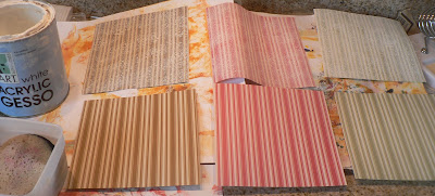
I liked how using watered down gesso lightened the underlying paper while still letting some of the color and the pattern show through when I was doing the Distressed Gesso technique. Decided to distress some extra scrapbook pages I have for another project using watered down gesso. Sponged the watered down gesso over both sides of my pages. You can see the difference here:
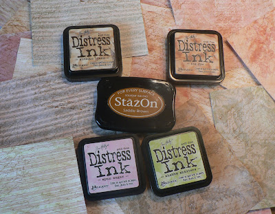
After the gesso dried, inked light pink Distress ink over the green and brown pages, light green Distress ink over some of the pink pages and beige and brown Distress inks over the other pick pages. Then stamped and over stamped french script with light brown StazOn ink. 
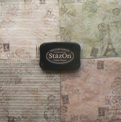
With the pages I'm using in my project I stamped images along the edges of both sides of the paper using dark brown StazOn ink.
Then I colored the edges of the pages with brown Brilliance ink.

Tuesday, May 4, 2010

D is for Distressed Gesso

D is for Direct to Paper (dtp), Distressing, Distressing with chalk inks & masking tape, (perfect) Distressing, Distressed Scraps, Decoupage, Dry Embossing, Drawing, Doodling, Distress Ink techniques, Double Resist, Domino, Double Saran & Water Color Sprays, and Distressed Gesso. For complete instructions on the Distressed Gesso Technique check out Trish's blog.

Trish mentions that there are no hard and fast rules, so I'm just showing what I did with this technique. Started with some music sheets and sponged on some gesso, trying to leave some areas without the gesso, let it dry then ran a Distress ink pad over it (dtp) and let it dry. It's ok to speed the drying process with a heat tool.
Repeated the process covering less the area with gesso this time, allow to dry. Adding another color of Distress ink (dtp) and let it dry.
Repeated the process only using water downed gesso for a lighter covering and a darker application of Distress ink (dtp) removed a bit of the same color with a baby wipe and let dry.
Same again, with a darker color of Distress ink (dtp).
And finished with a very watered down gesso, dried. Topped with a dark pink Distress ink.
Did another set of papers with a different color family of Distress inks.
This technique may also be done with plain white paper.