Friday, April 30, 2010

Book Study - Sea Sponge Techniques

This week in our study of Julia Andrus' book "Paper Transformed" on 
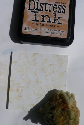
NGS group, we're looking at the section Sea Sponge Techniques. This is similar to stippling, but as no two sea sponges are alike, there is more variation in the application of color. You can use the sea sponge to apply paints, or gesso and paints, or inks. Today, I'm playing with Distress inks. Lightly spray the sea sponge with water to soften it. Add color to the paper by applying ink with the sea sponge. I like to start with the lightest color first:
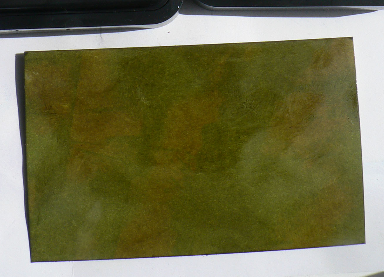
Continued to add more colors using crushed olive, peeled paint and forest moss Distress inks and Encore! gold ink:
For this one, used wild honey, barn door, aged mahogany, brushed corduroy and vintage photo Distress inks and Encore! bronze ink:
Decided to dry making the colors more intense by adding a drop of Distress ink to a craft sheet and lightly spraying with water. Used the sea sponge to apply ink to the paper:
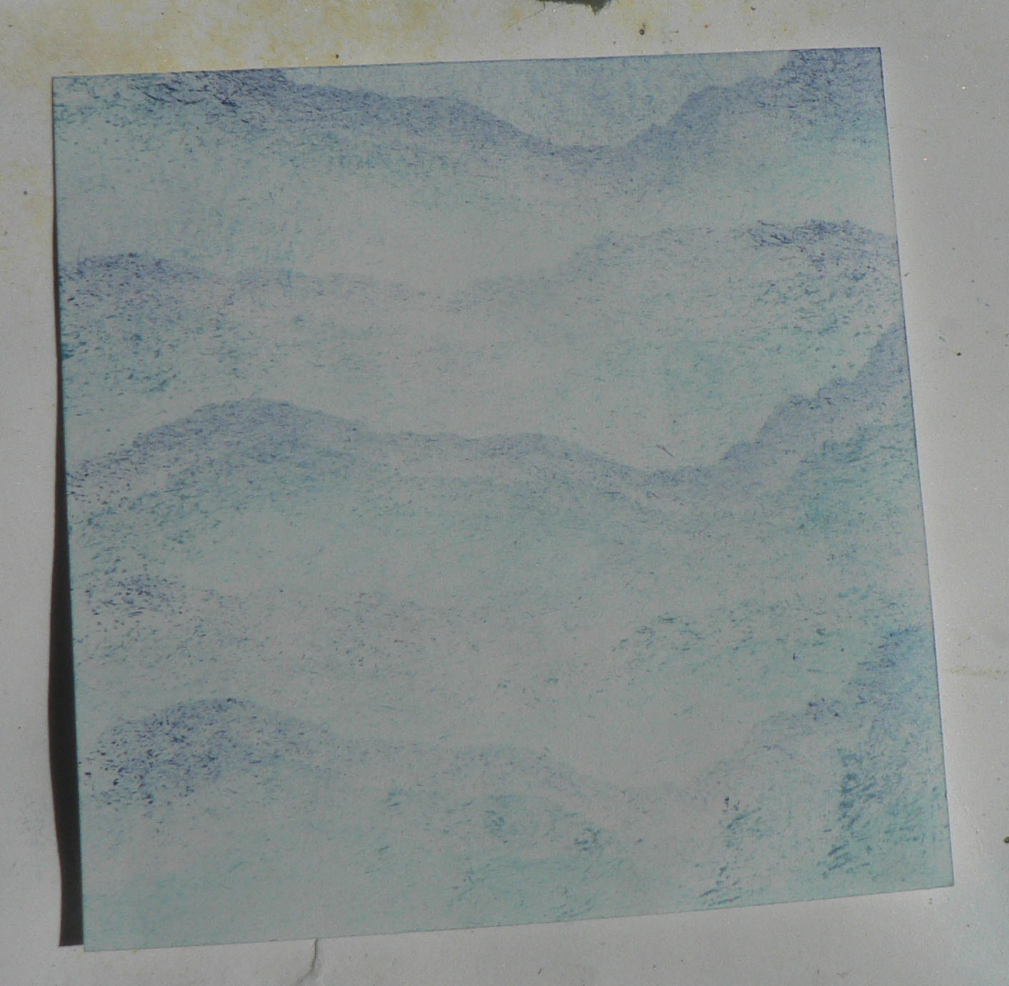
Continued to add more color, by using the re-inkers with stormy sky, bundled sage and shabby shutters Distress ink. Then I made a shimmer paste of Kiwi Perfect Pearls and water to sponge on:
Here's the finished paper:
Another fun technique with endless color combination possibilities!

Wednesday, April 28, 2010

Art in Nature

Even when I'm away on vacation, I'm inspired by what I see in nature. Compositions created by time and the elements:
or what the waves throw together:
even the process of decomposing:

the fabulous textures:
the marvelous textures and contrasts:

Keep your eyes open!

Saturday, April 24, 2010

Book Study - Stippling Methods

This week in our study of Julia Andrus's book "Paper Transformed" on NGS group, we're looking at the section Stippling Methods. Stippling is using a brush to apply ink or paint to your paper by pouncing the brush up and down on the paper. A stippling brush has stiff hairs close together. Stippling creates a light air brushed appearance and can be used to add shading and to define images.
One way to use stippling to create backgrounds is to use the torn edge of a paper to mask parts of the paper to which you are applying ink. Move the paper to add more ink to other parts. Add other colors as desired.
Stippled on tumbled glass, stormy sky and crushed sapphire Distress inks:
You can also use stencils when stippling. For this piece, I first rubbed on antique lined Distress ink to add variation in color to the white paper. Next lay stencil over paper and use stippling brush to add color as desired. Here I've added wild honey and dried marigold Distress ink.
With the stencil still in place, I also stippled on worn lipstick, victorian velvet, mulled lavender and dusky concord Distress inks. Then removed the stencil:
Stippling can also be done directly to the paper without stencils or torn paper. Here I've started with wild honey Distress ink:
Then continued to stipple using crushed olive, peeled paint, and forest moss Distress inks and finished with stippling on Encore! gold ink:
This is fun to create your own papers using the inks and paints you have on hand with endless possibilities.

Sunday, April 18, 2010

Notebook with inchies

Decided to make a square notebook for my inchie swap on ccswaps. We had to make our own inchies and use at least three on any project we wanted.
For the backgrounds on the covers (inside and outside), used the Spray Starch & Mica Powders papers I made earlier. Mounted the inchies done earlier today on to pale silver metallic paper and adhered to the front cover:
Used black Archival ink to stamp on script to the two inside covers. Mounted these inchies on to the silver metallic paper and then some scrap black paper I'd used to pick up the excess mica powder when doing the Spray Starch & Mica Powders technique:

Added the last inchie to the back cover:
Hope my swap partner likes shimmer and metallics!

Inchies

I'm getting ready for a swap where we must use at least 3 inchies in our project. Started by punching out 4 1" squares from one of the papers I made trying to do the "Garden Walk" background. I'm using the same background for my squares, as I want them to be able to stand alone, but also look well together.
On two squares, stamped butterfly images with black Archival ink and heat set. The designs in the other two pieces look like wings to me, so I outlined them with black permanent ink pen. Also inked the edges of the squares with black Archival ink.
Added cut out vintage images to the two squares without a stamped image. Added tiny pink rhinestones and words cut out of the dictionary to each square:
Cut out more 1" squares from the same paper and made more inchies:

Book Study - Direct to Paper

This week in our study of Julia Andrus's book "Paper Transformed" on NGS group, we're looking at the section Direct to Paper (DTP). Ink is applied to the paper or card stock directly from the ink pad (some use styluses with sponge applicators to do this technique). I have just gotten the new colors in the Distress inks, so that is what I'm playing with today. I like to use these on coated card stock as it allows the ink to blend well. I just tap or rub the ink pad directly on the card stock, starting with the lightest color, then adding colors from light to dark. You can use a paper towel to blend, I just use my fingers.
Finished background after adding tumbled glass, stormy sky and chipped sapphire Distress inks:
This DTP background was made using wild honey, stormy sky, crushed olive, and forest moss Distress inks:
Then did DTP with Encore! gold ink without blending:
A lighter DTP background using antique linen, spun sugar, victorian velvet, milled lavender and worn lipstick Distress inks and Encore! silver ink blended in:
Another DTP background using antique linen, barn door, aged mahogany, and brushed corduroy Distress inks and Encore! bronze ink blended in:

This technique is so much fun, so many possibilities with all the ink pads you have and the wide variety of combinations you can make!

Saturday, April 17, 2010

I Have Embossing Powder Swap

I've signed up for the "I Have Embossing Powders" swap on ccswaps. Decided to make a small notebook. For the outside covers I choose two of the Northern Lights Technique done on black glossy. On the front, stamped a large image with gold ColorBox ink, sprinkled with detail gold ep and heat set. After gluing the inside covers to the backs, inked the edges with gold ColorBox ink and coated with gold detail ep and heat set.
To add some texture to the Northern Light papers, sprinkled on some detail gold ep and heat set. Didn't use any ink as the ep randomly sticks to the glossy paper.
Used blank paper for the fillers and the Zutter Bind-it-All to bind the notebook together. On the front used the Zutter to punch additional holes along the bottom edge and wove in a decorative ribbon and tied on a gold colored bead.
Used the embossed worksheet pieces for the inside covers. Colored the edges of the image and saying with detailed gold ep as was done on the covers. Added a small brad heart to the image, it was dark grey, so I coated it with detail gold ep and heat set.
Added another quote with the edges done with gold ep to the inside back cover.
Outside back cover:

Embossing Work Sheets

I wanted to make some background paper using embossing powder (ep) and I've had this lovely sheet of paper in my craft area, left over from when I did lots of brayering. It was used under the pieces I brayered to protect my counter. This paper also has a few stamped images and some lovely gold Perfect Pearls over it.
Cut out two pieces:
Used gold ColorBox ink to stamp a textured image, covered with detail gold ep and heat set. I love how the gold ep contrasts with the rich colored dye inks in this paper.

Frosted Embossing Revisited

Had another play with the Frosted Embossing Technique. Wondered if using very thick embossing powder or UTEE would show off the technique better. Used the same butterfly stamp, clear embossing ink and UTEE. Caution when using UTEE, the bits will fly around if the heat gun gets close to the powder too soon. Some crafters will start by heating the piece from underneath.
Here's how it looks after rubbing on Perfect Pearls while the UTEE is still warm. I reheated the piece after rubbing on the Perfect Pearls, seem to help them shine.

Saturday, April 10, 2010

Spray Starch and Mica Powders

On NGS group we are experimenting with Spray Starch and mica powders to create backgrounds. There has been lots of different suggestions. I didn't have any spray starch in the house, but did have some Magic Sizing, and I figured it is close enough to spray starch to use as a substitute. I generously sprayed some on glossy black card stock.
On two of the papers, I sprinkled on a mixture of different mica powders.
Very generously sprayed on more Magic Sizing, then spread the powders around with my finger.
Layed white glossy card stock on top and squished it around.
Here's one set:
The other set:
There was so much sizing and powders, I wiped some off onto plain white sheet of card stock.
On the other two sheets of black card stock, I sprinkled some other colors of mica powders.
Sprayed on some more sizing and covered them with wrinkled up plastic wrap. Let it stand for a couple of hours.
Here's how they turned out:
There was still sizing and mica powders on the plastic, so I used some black matte paper to pick it up.